

I will never forget sitting in a campaign review meeting late last year. We had just launched a major search campaign, bidding aggressively on high-intent commercial terms. The ad copy was dialled in. The click-through rates were fantastic. The cost-per-click was right on target.
But the leads? Crickets.
It is a terrible feeling to watch a marketing budget drain into a page that simply does not convert. That experience was a harsh reminder that getting a prospect to click your ad is only half the battle. Once you have paid for that click, the user’s intent is in your hands. What happens next decides whether that campaign drives revenue or just burns cash.
When your main goal is getting conversions, the focus has to shift entirely to your Landing Page UX. Even the smartest ad copy will fail if the destination page is confusing, slow, or totally different from what the searcher expected. To actually win those leads, we have to look at our pages through the eyes of the people clicking our ads.
The Power of Keeping Your Promise
Think about the last time you walked into a hardware store looking for a very specific tool. Imagine asking a staff member where it is, and they just point to the massive shop floor and say, “Have a look around.”
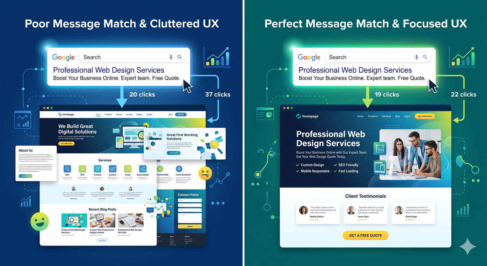
That is exactly what we do to users when we promise them a specific solution in an ad, but drop them onto a generic homepage.
People who are ready to buy do not want to hunt for answers. If they click an ad promising a technical SEO audit, the very first thing they see on the page needs to be about a technical SEO audit. If there is a disconnect between the ad text and the main headline, you force the user to think too much. High-intent buyers will not stick around to figure out your website.
They will just hit the back button and go to a competitor. Your headline and layout must instantly reassure them they are in the right place.
Speed Is the Ultimate First Impression
It is incredibly common to see businesses spend thousands of dollars designing stunning landing pages, only to have them fail because they take five seconds to load on a smartphone.
I spend a lot of my week deep in crawler data and technical site audits. I can tell you firsthand that a pretty page means absolutely nothing if it is slow. During a recent e-commerce platform migration we managed, we noticed a heavy drop in conversions on key product pages. The culprit was not the design. It was bloated code and massive, uncompressed images slowing down the mobile experience.
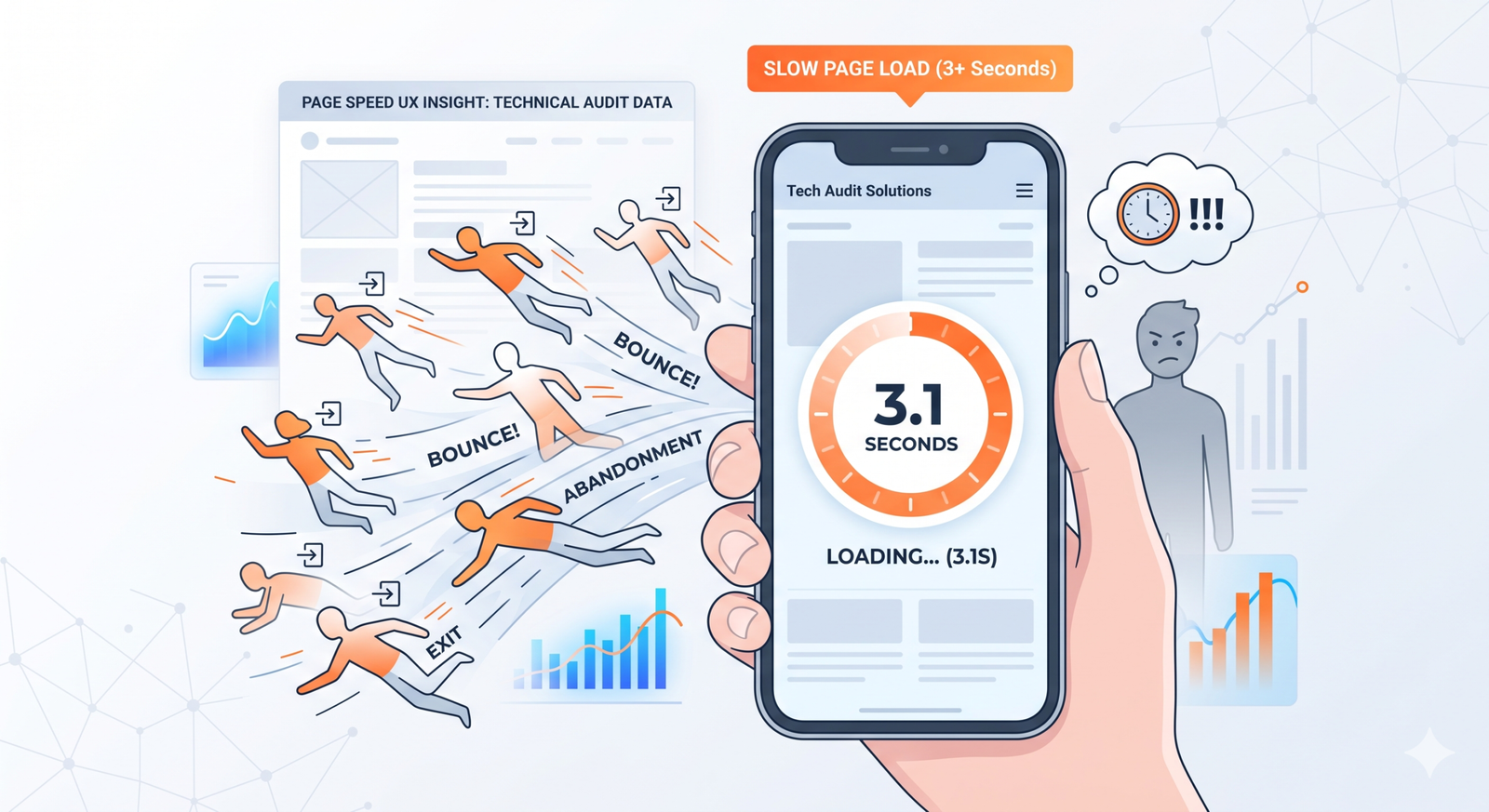
In the world of paid search, every second of delay actively turns away buyers. Before you launch a high-stakes campaign, make sure the engine under the hood is running smoothly. Clean up old tracking tags and compress your visuals. A great user experience requires solid technical speed.
Stop Asking for Too Much
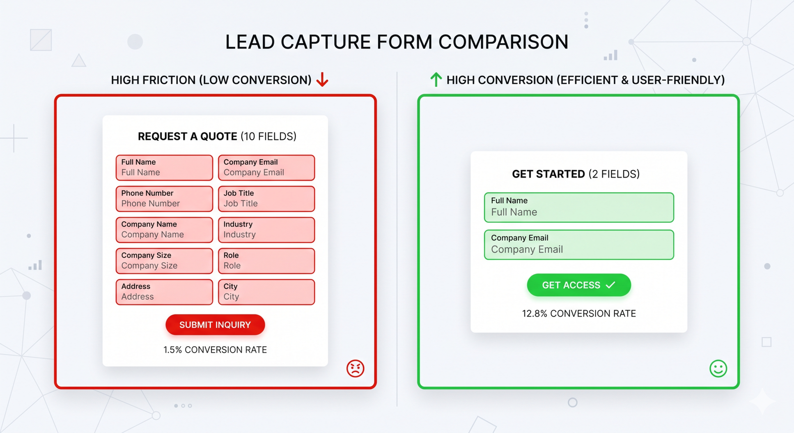
When someone lands on your page, you want them to take one specific action, like filling out a form or booking a call. But we often get in our own way by trying to give the user too many options.
Treating your landing page like a Wikipedia article with links to your blog, social media profiles, and complex menus is a mistake. It just distracts the user from the main goal.
You also need to look closely at your lead capture forms. Do you really need their phone number right now, or is an email address enough to start the conversation? Are you asking for their company size when you just need a name? I always challenge our team to remove just one field from a form to see what happens. Almost every time, the conversion rate goes up. Make it as easy as possible for people to say yes.
Building Real Trust
At the very bottom of the funnel, users are reaching for their wallets or preparing to hand over their contact details. Naturally, they are feeling a bit hesitant. A great landing page anticipates that hesitation and makes them feel safe.
Do not hide the great things people say about you. If you have a solid 5-star rating, put it right next to your contact form. Use real reviews from actual clients that talk about the specific problems you solved for them.
If you are selling a high-level service, people need proof that you can actually deliver. Case studies, client logos, and clear contact details show that you are a real, reliable business. It builds a human connection and proves you are worth their investment.
Never Stop Watching and Tweaking
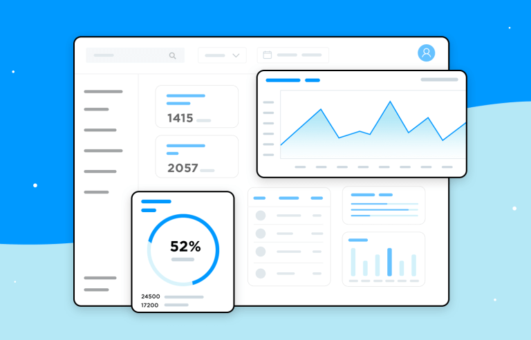
A landing page is a living document. You cannot just build it, launch it, and forget it. You need to watch how people actually use it.
![]()
Tools like heatmaps are brilliant for this. They show you exactly how far down the page people scroll before they lose interest. Your analytics will tell you if mobile users are leaving faster than desktop users. If your ads are getting plenty of clicks but no one is filling out the form, the data is telling you exactly where the problem is.
Search advertising is expensive, and you cannot afford to let bad design ruin good traffic. By matching your ad’s promise, speeding up your load times, keeping your forms simple, and showing real proof of your work, you turn a basic webpage into something that genuinely connects with your audience and drives your business forward.